
Interdisciplinary and
Inclusive UX/UI designer
Selected Works
01
| DURATION | 6 months (2025-2026) |
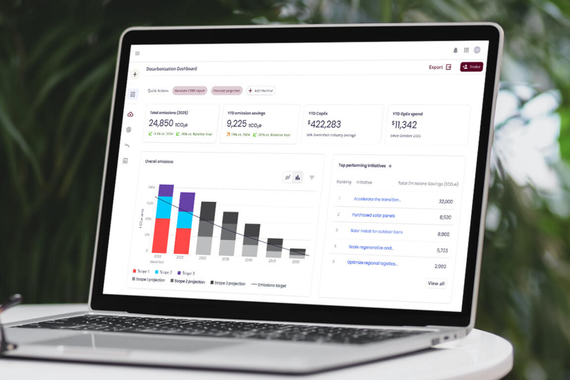
| OVERVIEW | Streamlining decarbonization data with a single source of truth and transparency. |
| DELIVERABLES | MVP of Decarbonization software |
02
| DURATION | 2 weeks |
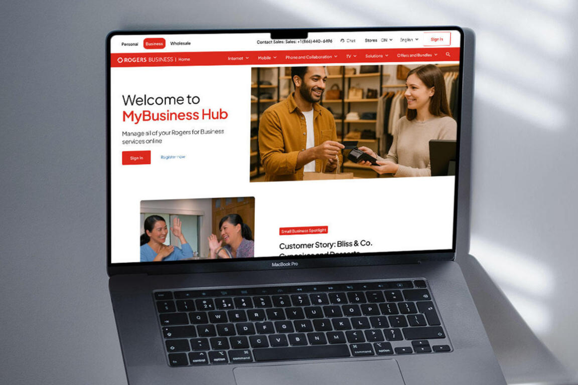
| OVERVIEW | A pitch to improve business customers' experience with accessibility at the forefront. |
| DELIVERABLES | AODA Accessibility Audit, Proof of Concept |
03
| DURATION | 1.5 months |
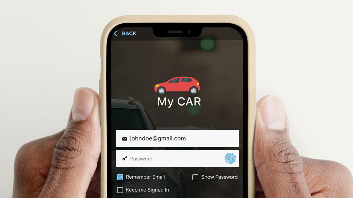
| OVERVIEW | Increasing and retaining app engagement with gameification and marketing promotions. |
| DELIVERABLES | Hi-Fi Wireframes, Prototype, User Flow |
04
| DURATION | 1.5 months (2024) |
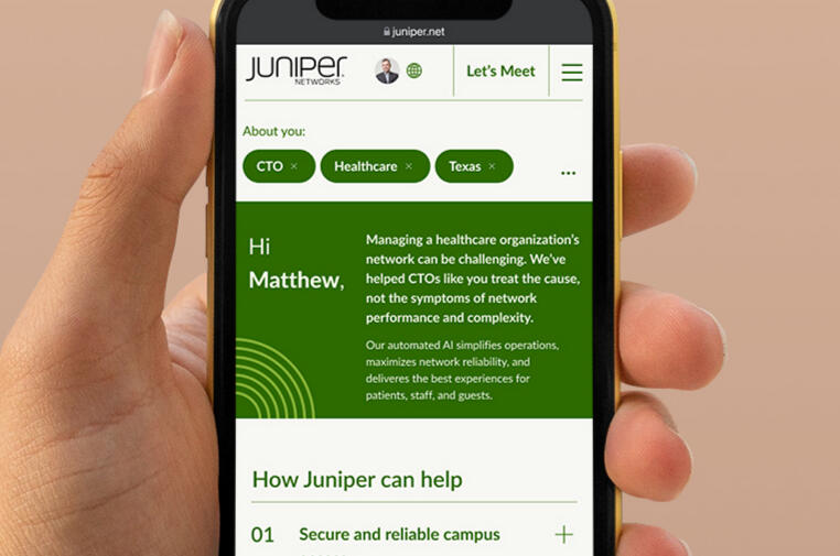
| OVERVIEW | Building trust and drive conversions through personalizing industry-specific information on products. |
| DELIVERABLES | Proof of Concept |
05
| DURATION | 3 weeks (2023) |
| OVERVIEW | A safe digital space to share stories during the holiday season. |
| DELIVERABLES | Proof of Concept |
06
| DURATION | 6 months (2023) |
| OVERVIEW | An easier way for consumers to submit medical claims without jumping through hoops. |
| DELIVERABLES | Accessibility Audit, UI, UX + Development, Design System, Wireframes, Prototype |
07
| DURATION | 4 months (2023) |
| OVERVIEW | Revamping health education with short videos to boast confidence for caretakers. |
| DELIVERABLES | Design System, Wireframes, Prototype |
08
| DURATION | 1 month (2022) |
| OVERVIEW | Connecting the musician to her fans in the digital age. |
| DELIVERABLES | Accessibility Audit, UI, UX + Development, Design System, Wireframes, Prototype |
09
| DURATION | 2021 (6 months) |
| OVERVIEW | Using machine learning to improve article recommendations for local newsrooms in order to reduce bias. |
| DELIVERABLES | Design workshop, Product iteration |
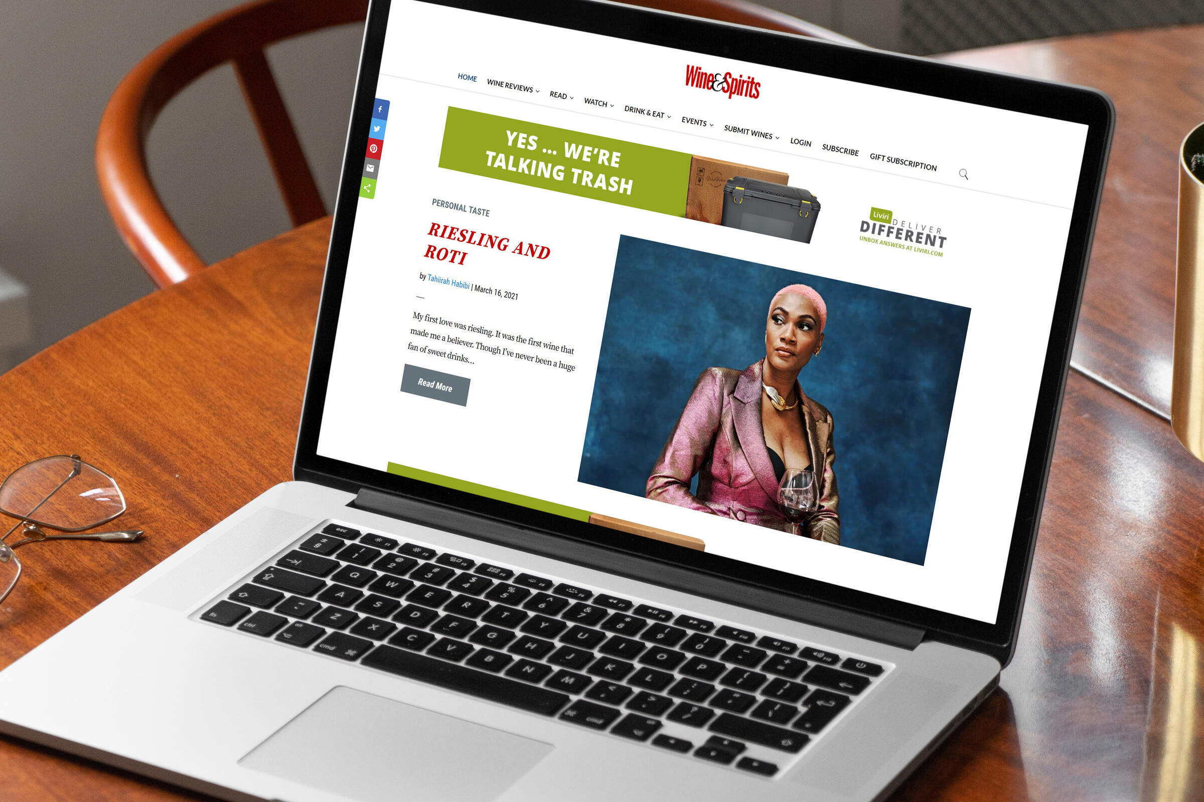
10
| DURATION | 2017-2019 |
| OVERVIEW | Reinventing the site experience that resulted in 124% increase in user engagement and 50% increase in subscriptions. |
| DELIVERABLES | Live website, Design iteration |
Category
B2B/B2C eCommerce
Role
Senior Product Designer
Duration
10 weeks (2026)
Overview
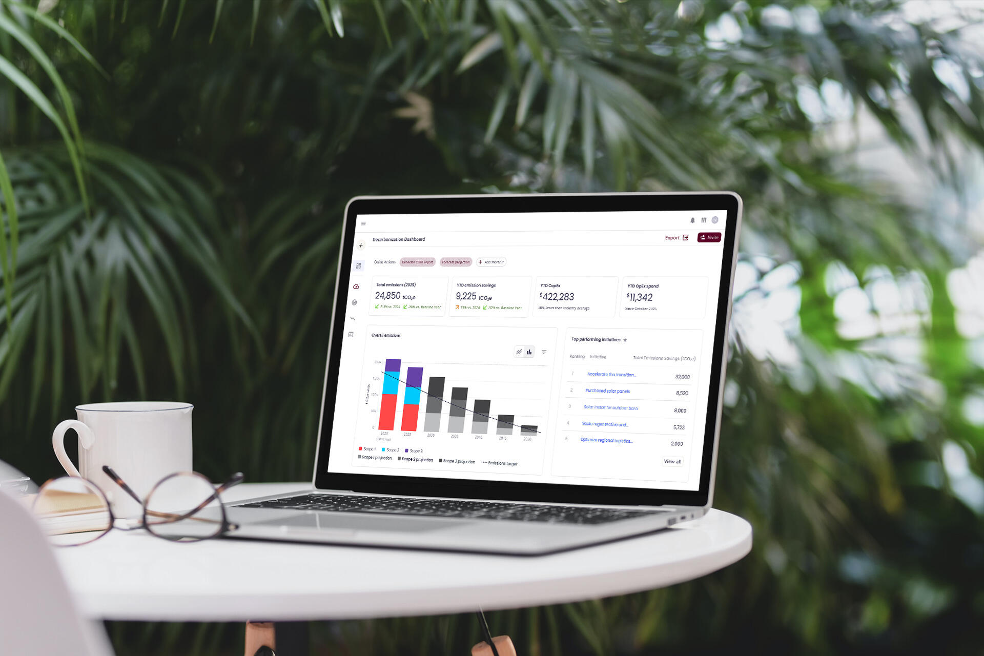
IBC* tasked us with bringing their in-store retail experience to their DTC (SB) and B2B (CP) e-commerce sites to lift engagement and conversions. Through UX audits, redesigns, and IA updates, we delivered a dual-track solution: rapid-fire design wins for immediate testing, and a long-term future-state roadmap.
Key Deliverables
Reimagined Navigation IA, PDP and PLP recommendations, AI assistant use cases and flow
Outcome
The low hanging fruit strategy worked well with the clients and have begun internally testing and applying our suggestions. They really loved our suggestion of working the AI as an enhanced search aid for the B2B site and a beauty assistant on the B2C, similar to what Sephora have done.
The Challenge
The teams were working in silos at the start, resulting in a lack of accountability, doubled up work and overall frustration.
Huge disconnect between the in-store experience and online experience for both B2B and B2C customers, like rewards.
IBC's team tried to retrofit a B2C experience onto a B2B due to the amount of customer data they had.
Both customers and internal teams had issues figuring out how to stack deals together without triggering errors.
Brand marketing jargon made SB lose its authentic voice.
We had to work within Salesforce capabilities.
A Mobile-First Experience
The data the client shared with us showed:
Most of their users preferred browsing on their mobile and app (which linked to their website) when shopping, especially for their B2B base.
SB has a very big DIY community.
They have very useful educational resources on both sites, but are buried.
Working with the UX researcher and strategist, I came up with suggestions for quick wins, ways to highlight their educational content and long-term growth with an AI assistant.
Chain of Command
Three personas were created to verify incoming data, have a digital paper trail and overall improve transparency within teams.Maria is a sustainability manager, the big picture person in decarbonization initiatives to see whether or not a target is on or off trajectory. She often tests the "what ifs" for initiatives.Maria gets her data from Carlos, the Project Lead, who supports and provides relevant information to support Maria's initiatives. He works closely with Dani, a Sector Lead, who is the boots on the ground manager talking to her team and fostering cross collaboration in keeping up to date with the latest data to send to Carlos.She discusses and executes decarb projects with her team based off of initiatives given by Maria, resulting in her creating roadmaps for projects within their budget.The three work together with a collective goal to drive company sustainability performances and demonstrate the impact through KPIs.

Maria's decarbonization dashboard

Dani's dashboard

Carlos' Project Edit

Carbon Calculator


Takeaways
Synergy From the Start
The client came ready with what they needed from us and were very communicative with our team. A quote from KPDH may have helped with this. I vibed with their head of UX so well that she felt I was reading her mind at times.
Loyal Fanbase = Unfiltered Truths
This project was one of the few where I was able to speak directly with IBC's customers. They were all very helpful with their suggestions, feedback on our design proof of concepts and very straightforward.
Taking The Lead
I took on the principal designer's role after he had an unexpected medical emergency. I worked closely with our strategist, product managers and UX researcher from India. It was a challenging but very fruitful experience. My team was very supportive during this time.
Trust Your Gut
When our client wanted unexpected deliverables a part from of the original agreement, the project manager said not to mind it; my intuition said otherwise. A few weeks later, the PM asked me how long it'd take to create said deliverable; he didn't know I already did 2/3 of the work during sprint downtimes. The remainder was passed onto the UX researcher to flesh out before presenting. The Client Partner rep on our team jokingly said I should predict lottery numbers.
AI Saved Our Butts
The strategist and myself were up to our eyeballs on user interview data. Were it not for Copilot helping us with summarizing common points, suggestions, competitive analysis, and ranking based on urgency, we wouldn't have been able to work as fast as we did.
*Company name has been white labeled due to NDA.
Global Safety Organization
01
Global Safety Organization*
Category
Safety Science
Role
Product Design Lead
Duration
6 months (2025-2026)
Overview
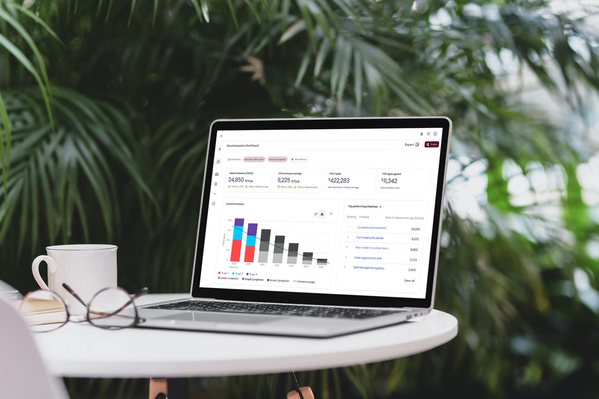
As Product Design Lead, I designed an MVP decarbonization product for enterprise clients of a global safety, security, and sustainability leader.
Key Deliverables
MVP of Decarbonization software
Outcome
Though rounds of interviews with project cohorts, design feedback and presenting our results to SMEs and leadership, we received good feedback on the progress.However, due to the annual budget review and renewal, the project was not green lit to launch for MVP and was shelved for future development.
The Challenge
Customers rely on static Excel files, leading to frequent data errors and time-consuming manual follow-ups.
Decentralized files and endless email threads isolate teams and break cross-functional workflows.
Without audit trails or change logs, teams cannot track accountability or verify data integrity.
Calculating Scope emissions across varied sectors like manufacturing and real estate remains inherently complex.
Bringing it all together
The MVP decarbonization software will help users manage and collect their company's carbon footprint data in in one space to gradually wean them off of spreadsheets. An internal AI trained off of a company's data will help expedite manual processes. The platform will help:
Trajectory tracking for decarbonization plans.
View current initiatives and projects.
Importing spreadsheets and other files to expedite data entry.
Optimize a blueprint with data-based suggestions from the company's internal AI.
Generate downloadable annual/quarterly reports in PDF.
Data visualization.
Post-MVP, my team and I began exploring possibilities in how AI can play a role as an assistant in suggested actions for decarb initiatives and how it can be integrated into a carbon calculator that shows savings of CO2 emissions based on the Scope chosen.
Chain of command
Three personas were created to verify incoming data, have a digital paper trail and overall improve transparency within teams.Maria is a sustainability manager, the big picture person in decarbonization initiatives to see whether or not a target is on or off trajectory. She often tests the "what ifs" for initiatives.Maria gets her data from Carlos, the Project Lead, who supports and provides relevant information to support Maria's initiatives. He works closely with Dani, a Sector Lead, who is the boots on the ground manager talking to her team and fostering cross collaboration in keeping up to date with the latest data to send to Carlos.She discusses and executes decarb projects with her team based off of initiatives given by Maria, resulting in her creating roadmaps for projects within their budget.The three work together with a collective goal to drive company sustainability performances and demonstrate the impact through KPIs.
Maria's decarbonization dashboard
Dani's dashboard
Carlos' Project Edit
Carbon Calculator


Takeaways
Sustainability is Cool and Vast!
This was a huge learning experience in the sustainability space and how carbon footprint is measured.
Chasing Waterfalls
Before joining this team, they were used to working Waterfall. Most of them understood Agile as a concept and it was hard to find a balance sometimes.
Analysis Paralysis
When I shared the list of interview questions to review, the product owner's replies would either spiral down a rabbit hole or the question was "too broad" to ask. A UX Researcher was brought onto our team to take over this task.
Context is Important
Due to the complexity of sustainability, some necessary information we needed to know were told to us after the fact. Were it not for ChatGPT summarizing the main facts, this project wouldn't have gotten this far.
Too Wide A Net Casted
The product owner reached out to anyone and everyone who they thought would be a good fit as a cohort. As a result, it was a scramble to get user interviews scheduled when we barely had responses.
*Company name has been white labeled due to NDA.
Rogers Communications
02
Rogers Communications
Category
Telecommunication (B2B)
Role
Senior UX Designer, Accessibility Designer
Duration
2 weeks
Overview
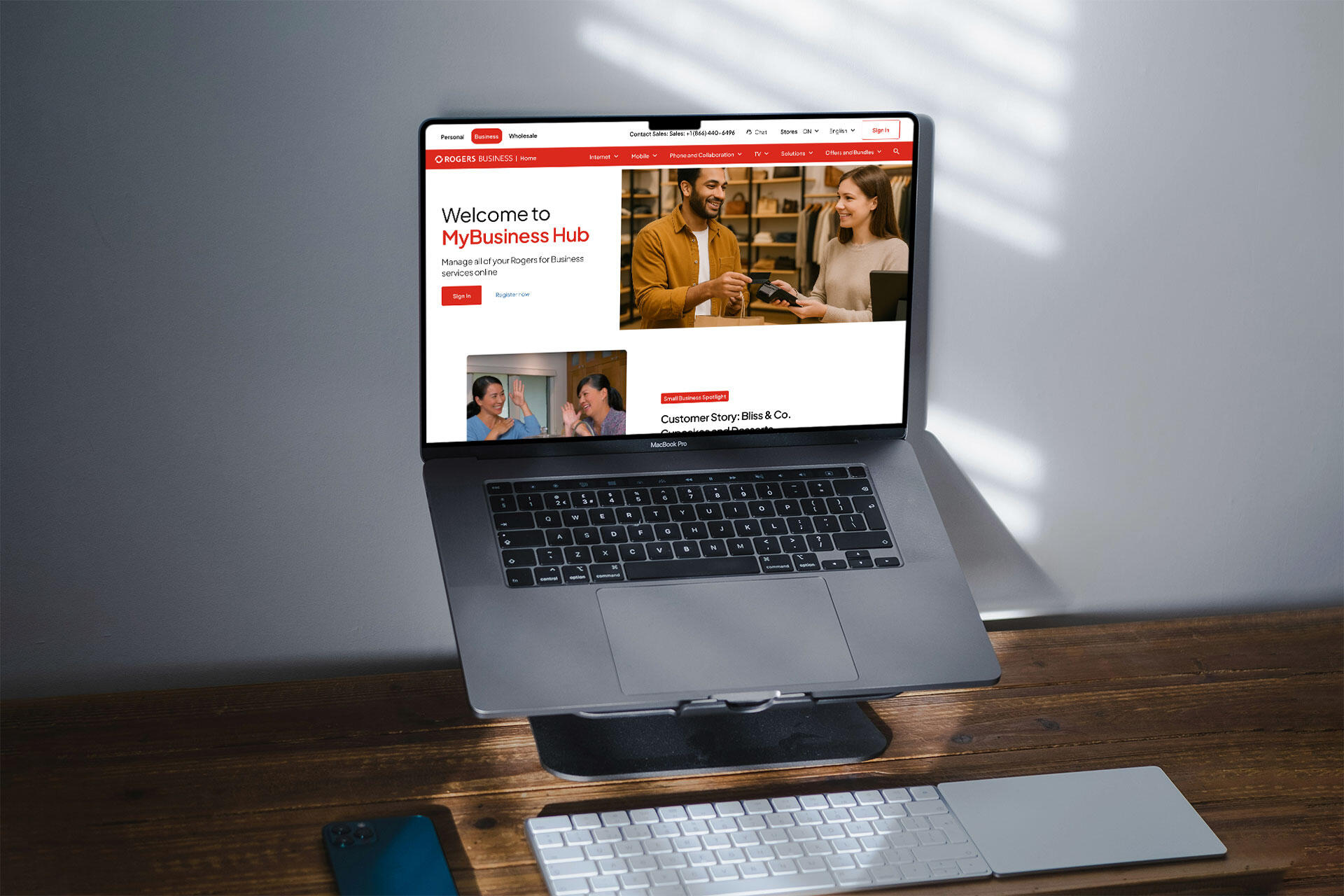
For Canadian telecom leader Rogers, I led the UX strategy for an RFP to reimagine the Rogers Business portals in identifying key opportunities to empower B2B buyers and vendors to make confident, business-critical decisions.
Key Deliverables
AODA Accessibility Audit, Proof of Concept
Outcome
We delivered three portal POC screens and a navigation overhaul. The strategic vision and constructive critique resonated strongly across Rogers’ analytics and design teams as being "politely criticized in a good way," successfully winning WongDoody the account.
The Challenge
Despite Rogers being a household name in Canada, their business product dashboards and portals did not reflect this. Key issues found during the experience audit included:
Inconsistencies in navigation, page design, responsiveness and information architecture.
Redundant and misplaced actions that reflect poorly on Rogers' products and branding for B2B customers.
Long and confusing action names in links and buttons.
Accessibility issues with keyboard navigability of portal sites, such as no focus state to highlight content and skipping chucks of content. Button sizes are too small for touchscreens. Some colors used for text do not pass AA WCAG 2.1 contrast.
Bilingual selector was not working, possibly isolating French Canadians who use Rogers services.
Process and Content Strategies
Working together with the strategy team, we focused on:
Hyper-personalization of client portals to drive better tailored internal product and service offers for marketing.
Drive reliability and accessibility with intuitive changes to self-service portals.
Make Rogers Business products the main characters and relatable to B2B needs.
Flex our team's previous telecomm experiences with T-Mobile, Verizon and AT&T products.
A side-by-side screen comparisons with numbered and highlighted boxes helped show the differences between the client's current experience and the proof of concept.
Accessibility Audit
Due to time constraints, I focused the AODA audit on keyboard navigability and WCAG AA color contrast. Key findings revealed significant inconsistencies in keyboard navigation variation across portals (15% to 80%), focus states were either low-contrast or relied on default dotted outlines, and footer gray text failed AA contrast minimums. Given more time, full screen-reader testing (VoiceOver/JAWS) would be a priority.Please click on the images for a larger view.
Navigation and Structure Enhancement

Navigation comparisons between Rogers current state to the proof of concept redesign.

Footer comparisons between Rogers current state to the proof of concept redesign.


Consistent global header and footer implemented across the site to reinforce brand reliability, identity, and user experience.
Language and location selectors relocated to the top navigation for improved visibility for French-speaking Canadians and accessibility.
Search bar repositioned closer to account info for better functional grouping.
Footer accordion removed to show full footer content and improve browsing experience.
Optimized Content, UX, and Functionality

Comparison between Rogers Business' current small business highlight to the proof of concept design.

Comparison between usage of empty space to use for product and marketing campaigns in the proof of concept.

Layout comparison between Rogers Billing page to the proof of concept design with a cleaner UI.


B2B product offerings summarized to reduce cognitive load and better communicate purpose.
"Small Business Spotlight" links to real customer stories instead of generic placeholders to reflect authenticity and Rogers' positive rapport.
Empty landing page areas utilized for marketing promotions and specific product opportunities and inquiries.
Quick links added to right rail in Bills and Payments page for faster access to other Rogers products for users.
Account number links improves user access to full account details.
Download actions grouped under a kebab menu for a cleaner, more intuitive interface.
Customizable shortcuts for vendors to navigate more efficiently within the product portal.
Simplifying Customer Support
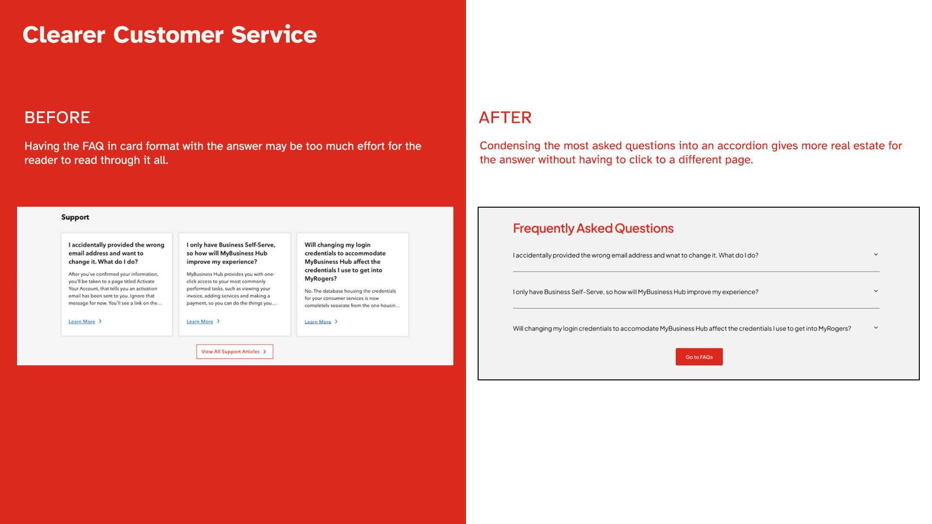
FAQs are condensed into accordions showing only most commonly asked questions. Users interact with it to see the answer they want to see help reduce cognitive load. I highlighted to the clients the potential of internal collaborations and workshops with internal customer reps to help better tailor support content.
Takeaways
Accessibility Baked In!
When the project lead told me the client wanted "accessibility first," I was locked in. In previous projects, accessibility was always a sprinkle in and not part of the ingredient list.
Learning from the Past
While drawing up the HiFis, I referred back to the Juniper pitch in simplifying the design and put the spotlight on the products, not the page layout.
03
Global Automotive Company*
Category
Automotive
Role
Senior UI Designer
Duration
5 weeks
Overview
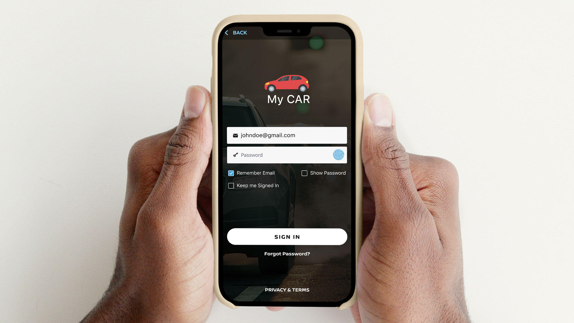
A global automaker’s U.S. branch partnered with us to integrate direct service offers into their iOS apps (MyCar** and MyFancyCar**). The goal was to enhance the in-app experience, boost engagement and brand loyalty, and unlock new revenue streams.
Key Deliverables
Hi-Fi Wireframes, Prototype, User Flow
Outcome
We over delivered with 3 use cases in the prototype. Proposed features were set to be implemented and explored by the client in Q1 2025. Were I part of the handoff and relaunch, I would track downloads, offer conversions, and dealer feedback to steer feature iterations, while piloting dealership onboarding and exploring AI personalization for future releases.
The Challenge
The U.S. automotive team approached us to improve their iOS app’s engagement and loyalty features. When our strategy team interviewed internal stakeholders on current pain points, they noted:
Underutilized marketing data and decentralized dealership systems.
Low awareness and use of the app post-purchase; even those within the company.
Owners of older MyCar models that lacked smart car features were left out.
Disconnected owner experience after initial sale due to missed critical updates like check-up reminders, lease expirations, and subscription renewals.
Drivers only used the app to control their vehicle's temperature and check the location of their vehicle.
"Moments That Matter"
We mapped the ownership journey with:
In-app service reminders and seasonal promotions
Loyalty points for service visits to apply to future services or accessories
Personalized anniversary content (e.g., Spotify Wrapped-style recap)
Lease-end notifications with upgrade incentives
My previous experience with the Canadian division of MyCar gave us a head start, allowing us to quickly build on prior insights and assets.
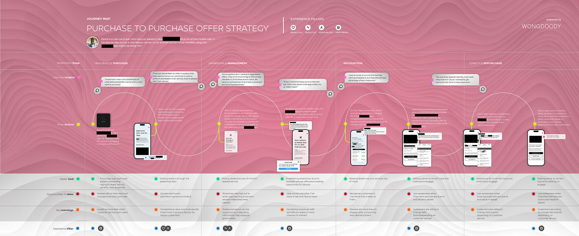
Our persona, David's, journey map as a new owner of a Model-R from MyCar using the MyCar app from onboarding to the end of his lease.
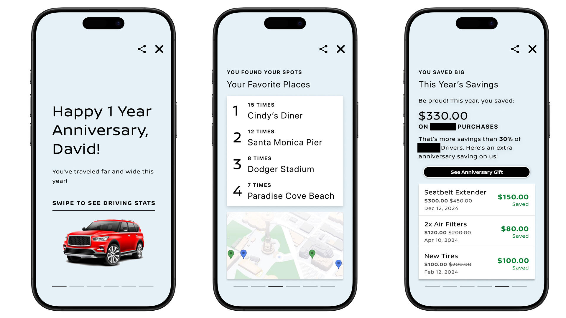
Mobile screens show David's R-Model vehicle analytics to celebrate his 1st anniversary as a MyCar* owner.
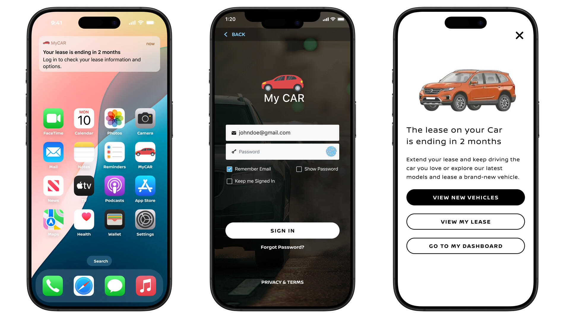
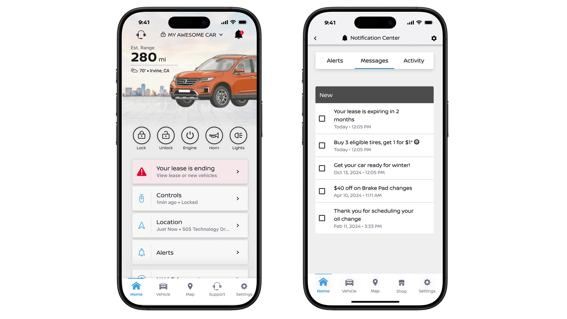
David is logged into MyCar with a lease ending reminder on the dashboard and messages area.
User Journey: David, an Informed Owner from Start to Finish
Press the play button above to view the experience.
To better understand the consumer's journey post-purchase, we created a journey to reflect how a new MyCar** owner might experience the refreshed app from onboarding to lease renewal.
1. Awareness and Exploration
David purchased a new MyCar** R-Model and downloads the app with the dealer onboarding him with app features. As he clicks around, he opts into in-app notifications, which highlight service perks when needed.2. Personalized Rewards
Each time David services his car, he earns points to use on accessories or future services. On his 1-year anniversary, the app sends a fun recap of his year with the R-Model.3. End of Lease
As David neared the end of his 3 year lease, the app sends him a notification 2 months in advance, with an incentive to either extend the lease or purchase a new vehicle, beginning the loyalty cycle anew.
Takeaways
There's such a thing as too useful
I'm all for streamlining and making things to work better, but there's a limit to that.
Visual data nerd unlocked
Full disclosure: I've only started using Spotify last year and got the year in review to see what the fuss was all about. I get it now. Why hoard all that data from your users and not make use of it into something fun like a year in review? Possibilities are endless!
Collecting car points
I'm always up for gameifying basic tasks and getting points. It's just so rewarding. I wish other companies would do that more; they do it with credit cards.
A refreshing, straightforward project
Having worked with this company's Canadian branch 2 years ago, these clients were so easy to work with and voiced their requests clearly. They were such a pleasure.
*Company name has been generalized due to a signed NDA.
**App name has been changed to protect client IP.
04
Juniper Networks
Category
Enterprise Web (B2B)
Role
Senior UI Designer
Duration
3 Weeks (2024)
Overview
As part of a WongDoody pitch, I partnered with the Product Design Director to reimagine the web experience for Juniper Networks, a global leader in AI-driven networking and cybersecurity. Our goal was to drive trust and conversions by elevating buyer transparency, strategic storytelling, and personalized digital journeys.
Key Deliverables
HiFi Wireframes, Proof of Concept
Outcome
We presented 3 end-to-end prototypes and 2 frictionless user journeys to drive conversions for enterprise level decision-makers and technical analysts. Unfortunately, we did not get the account.
The Challenge
Even though Juniper is a leader in its industry, their website at a glance:
Did not effectively explain the value of their services to potential customers.
Lacked personalization for different buyers in roles and industries.
Too much tech jargon.
The buying journey was misaligned with real-world decision making.
B2B buyers wanted industry-specific info on topics like AI. The journey involved both decision-makers (CTOs) and subject matter experts (SME), so the content had to be practical, and easily read.That insight shaped our pitch’s North Star: “Demand facts, not fluff.”
Content Strategy and Process Highlights
To build trust in Juniper, we used the Gartner Magic Quadrant to find key innovation milestones reflected in the design. We worked closely with the strategy team to ensure everything aligned with broader messaging and business goals.We based the journey design around a collaboration between CTOs and analysts in a B2B buying processes.
The experience starts with the prompt: “What part of your network keeps you up at night?”
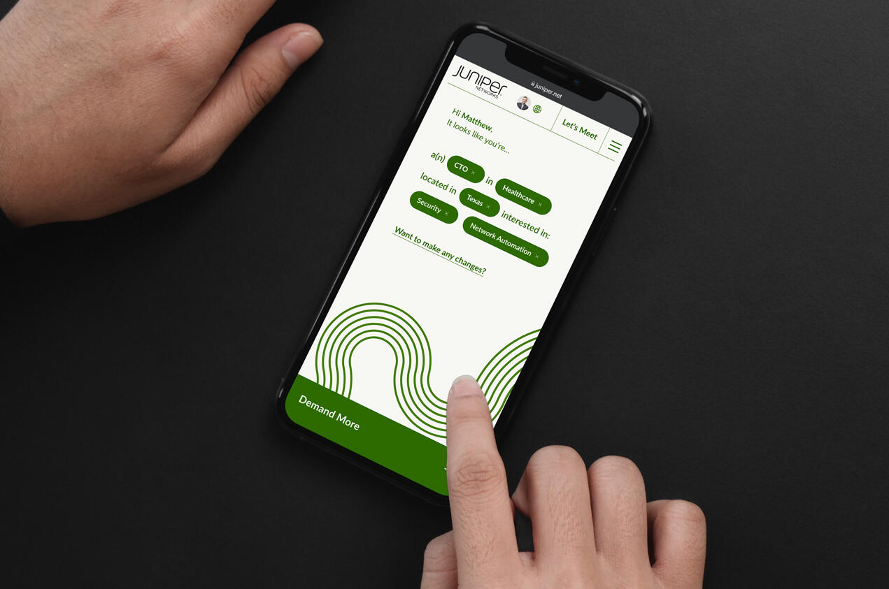
Users selected their pain points, goals, products, industry, and role in order to receive tailored content.
We tried a Mad Libs-style fill-in-the-blank interface, but pivoted to clearer prompts based on feedback.
Emphasized the mobile site experience over desktop.

Key features from the decision maker's user journey, starting with the conversation prompt, leading to integrate his LinkedIn account.

Key features from the SME's user journey, with what the decision maker shared with him to the SME interacting with the chat bot.


Collaboration between CTO and SME
B2B purchases often involve both decision-makers and technical experts. The strategy team mapped a realistic journey to show how a CTO (decision-maker) and a Senior Enterprise Architect (practitioner) might collaborate during the buying process.The journey below starts with Matthew, the CTO, perusing the internet for trends in order to guide a business transformation; he shares what he finds with Vihaan, a Senior Enterprise Architect.
Press the play button below to view the experience.
1. Awareness and Exploration
Matthew scans for trends to guide a business transformation and encounters a thought leadership article by Juniper and clicks through to the website via CTA. He begins exploring the relevant content and interacts with an embedded widget that offers a deeper look into Juniper's potential.2. Contextual Personalization and SharingAs Matthew continues engaging, the site personalizes content of strategic insights and case studies based on his role and industry. He shares a persistent, unique link of the content to his colleague Vihaan over Microsoft Teams.3. SME EngagementVihaan joins via Matthew’s link, connects through LinkedIn, and uses the chatbot to ask about open architecture. His activity tailors the content to highlight specs and documentation for project scoping.
Takeaways
First time pitching
This was the first time I was involved with a project pitch. It was exciting to see how strategy and our client partner teams worked together with us.
Healthy competition
While I went the more traditional tech route in concept, the director went for a sleeker, more minimalist design. I felt like a toddler doodling non-sensical lines on paper compared to his design. I learned a lot from this experience and realized still how much I have to learn.
05
Hackathon 2023: Holiday Voices
Category
AI Prompting
Role
UX/UI Designer, Art Director
Duration
3 Weeks (2023)
Overview
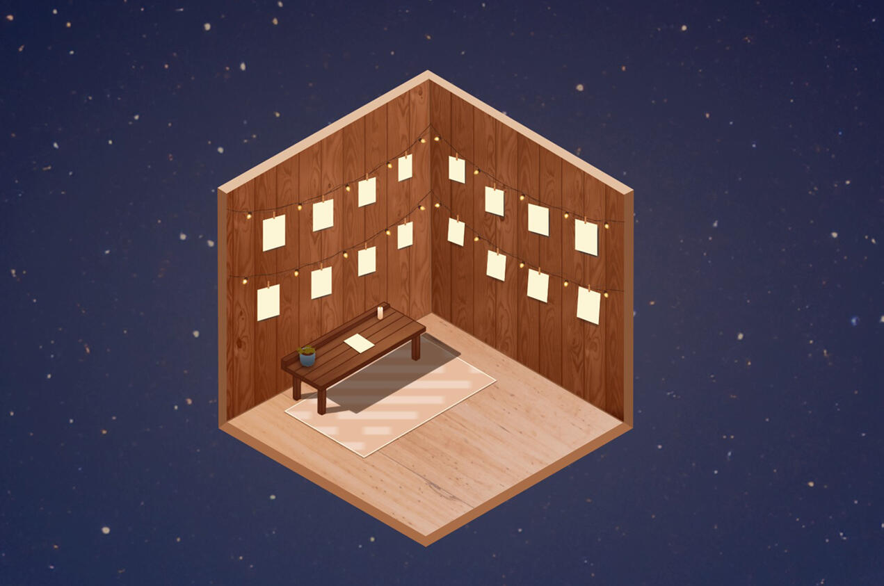
WongDoody's SVP of Experience Design wanted our internal EX team to engage in an annual hackathon with the inclusion of AI usage. We were asked to create a fun, interactive holiday experience to bring WongDoody designers together across studios worldwide that's web-based, and easy to share. One team will be crowned “People’s Choice” at our internal XD team meeting.
Key Deliverables
Proof of Concept
Team Process
Our respective internal team was randomized; mine comprised of the designers out of the NYC office. Home field advantage, let's go! Since the hackathon was holiday themed, our team names had to reflect that; we decided on "The Silent Knights."We complied ideas on a Miro board and voted based on tech lift and inclusivity. Some ideas we had included a wrapping paper pattern generator, create a holiday song using an AI music sequencer, and bake your own cookie.We tied between "Build a snowman/gingerbread house" and "What do the holidays mean to you?" and ultimately chose the latter.Spoiler alert: It was my idea 😀I was inspired by three things: an online game called Kind Words, a traveling art installation called Strangers Project, and Humans of New York.We called ours Holiday Voices.Please click on the images below to make larger for viewing.

Sketches, mood boards and color palette explorations

A modal text box appears for the user to write their holiday story anonymously in a safe, digital space.


A Cozy Digital Pocket
We wanted to create a safe, anonymous digital space where people could share their unique holiday experiences without fear of judgment or toxic positivity. To bring this to life, a junior UX designer and I worked on the art direction using Photoshop’s GenAI, while our team lead used ChatGPT to help build the site on a cloud server. I also added warm, inviting background music with AI-generated tunes.We pulled it all together in about three weeks, with our lead fine-tuning the code and adding illustrations from another designer. While we didn’t win “People’s Choice,” I’m really proud of what the team accomplished and loved sharing the project with everyone.
06
EqualPrice*
Category
Healthcare Insurance
Role
Senior UI Designer
Duration
6 months (2023)
Overview
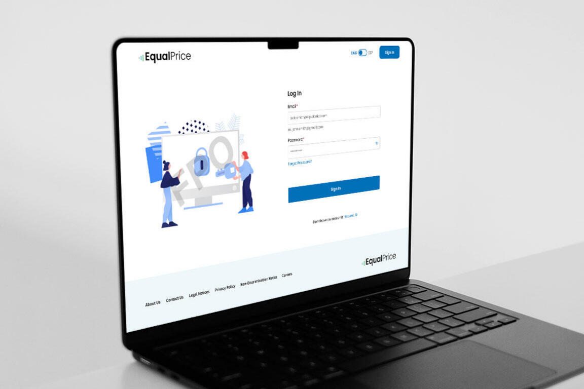
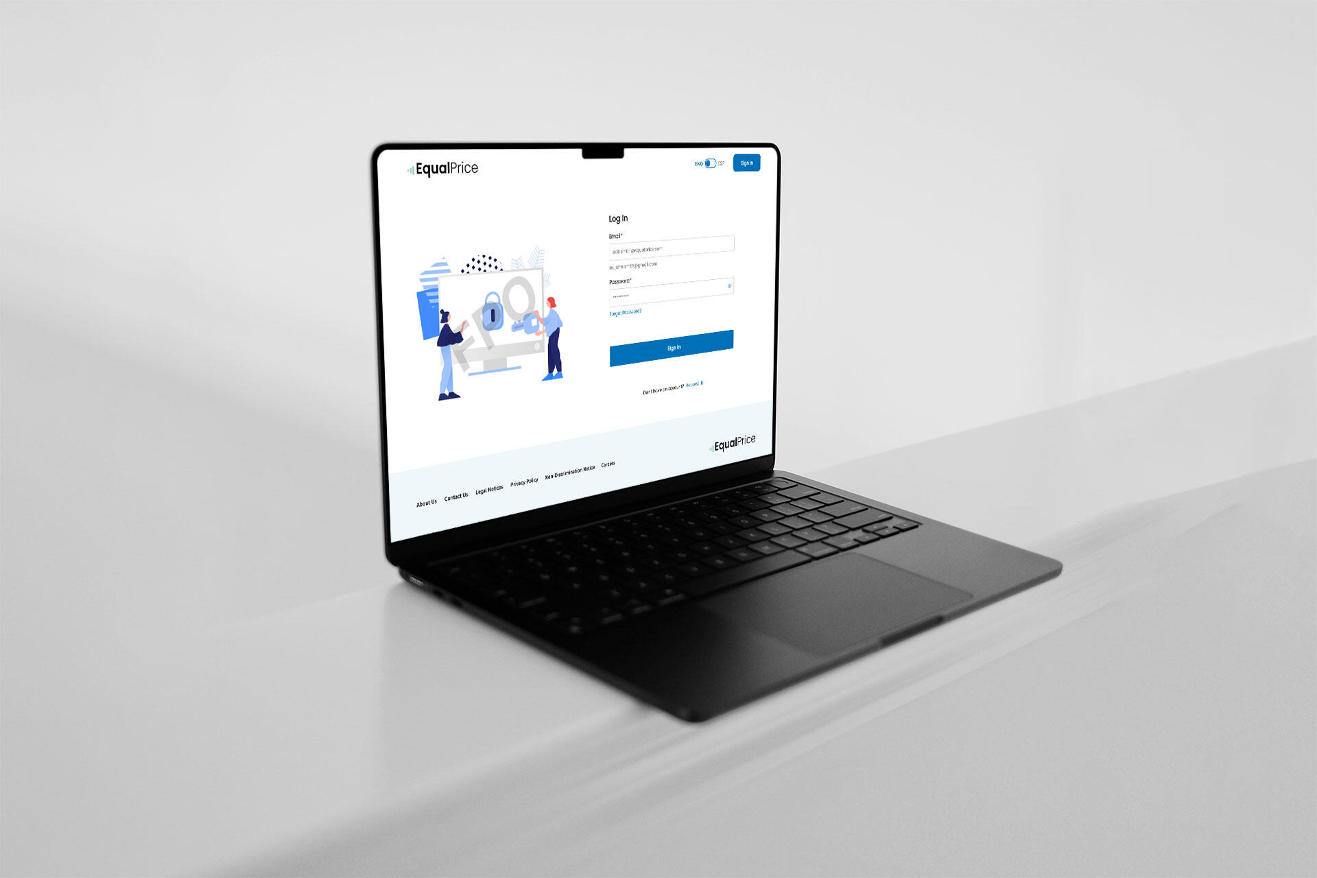
EqualPrice* is a healthcare platform built around the No Surprises Act, helping patients navigate medical claims and estimate costs. Partnering with their internal UX team, we simplified the claims experience through clear data visualization and self-serve resources. The portal was designed from the ground up to be responsive, WCAG 2.1 AA accessible, and bilingual (English/Spanish) for members, providers, associates, and negotiators.
Key Deliverables
Accessibility Audit, UI, UX + Development, Design System, Wireframes, Prototype
Outcome
Three user journeys were created, with 2 newly added personas and journeys for iteration. Due to the project scope and budget constraints, extra phases were cut. The site was launched in Q4 of 2023.
The Challenge
Before the No Surprises Act, many patients had to jump through hoops in order for their medical claims to be submitted and confirmed. The fractured system created friction and frustration between patients, insurance companies and medical offices due to miscommunications and important information falling to the wayside and; this was the case for those who did not speak English.To resolve this, we needed to:
Fully understand each persona and journey created by EqualPrice's internal UX team.
Simply the process of submitting a claim for patients.
Have a way for the patients to track their referral progress.
Ensure the website is bilingual in English and Spanish.
Tailoring the Experience
To translate complex medical claims into a seamless, responsive product, we partnered closely with EqualPrice’s UX team and SMEs. Building on their initial research and journey maps, we aligned the project around three key personas: Members, Providers, and Negotiators. This directly shaped our three-phase roadmap.The resulting workflow mirrors debt consolidation: a Member submits a claim, and a Negotiator works directly with the Provider using the EqualPrice Editor to calculate a fair, agreed-upon settlement.
Accessibility Baked In
I made the style guide and design system based off of the color palette of EqualPrice's logo while keeping at front of mind that the product needed to be WCAG 2.1 AA compliant. Using tools like WebAIM, ContrastChecker, and Stark for color contrast and font sizing, I made a design guideline with dos and don'ts with font usage and styling.
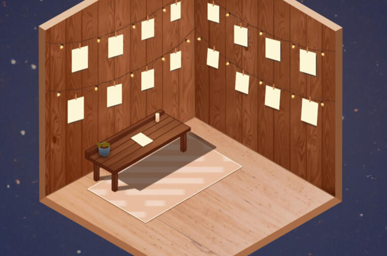
Due to the NDA I signed with the client, I am unable to post any designs to protect the their IP.
*Company name has been generalized due to NDA.

Contrast check for EqualPrice's light blue with ContrastChecker and WebAIM.

Contrast check for EqualPrice's light green with ContrastChecker and WebAIM.

Text visibility check with EqualPrice's brand colors.


07
Understand the Science
Category
Healthcare Education
Role
Senior UI Designer
Duration
4 months (2023)
Overview
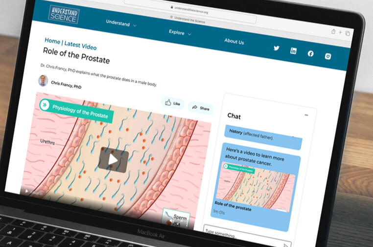
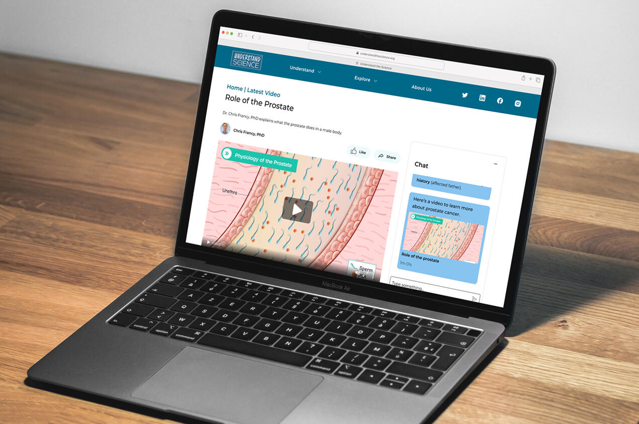
Understand the Science (UTS) is a non-profit dedicated to demystifying complex medical topics through scientist-led, sub-two-minute videos and a real-time IBM watsonx AI assistant. To support their growing media footprint, our team was brought in to elevate the overall user experience, design an accessible medical content hub, and establish a scalable design system.
Key Deliverables
Design System, Wireframes, Prototype
Outcome
Launched in early 2024, the platform integrates cited medical content, a WCAG-compliant design system, and an interactive IBM watsonx AI assistant.
The Challenge
Their original site was a proof-of-concept that only focused on opioid abuse video content.
Accessibility issues with video player like lack of media controls and close captioning.
Information architecture was limited and couldn't scale for growth.
An IA-led Process
By prioritizing video content over dense text blocks, we helped UTS with:
Grow their digestible video content to be shareable to other social media (e.g. TikTok).
Developed a design system that's compatible with Bootstrap, meeting WCAG 2.1 AA level.
Created cross-linked content architecture for related topics (e.g. diagnoses & treatments).
Introduced multiple discovery paths: chatbot, menus, and library for varied user behaviors.
Helped leadership and board to define long-term IA strategy and flexible content modules.
Explored AI capabilities of watsonx beyond Q&A, like dynamic user flows and interactive learning.
Please click on the images below to view in a larger format.

Sample of Understand the Science's design system for mobile and deskop.

Understand the Science high fidelity wires for the website's redesign.

Understand the Science's palette was based off of Bootstrap. A contrast test was done with Stark and WebAIM to make sure it passed WCAG 2.1.


Color Contrast Test for the Design System
UTS' brand colors were around Bootstrap. While the base semantic colors were there, the palette itself is very neutral. We also introduced a new shade of blue for functional use on category chips, a secondary button color, and so on.With every shade we tried, I made sure to run it across Stark and WebAIM to make sure it passed contrast. And because I'm an overachiever, I specifically chose shades of blue that passed AAA.
User Journey: Finding UTS Through Social Media
We created two user journeys. The video below shows the website is shared via social media to our user from their friend, Jaclyn.
Press the play button below to view the experience.
Takeaways
Oh God. It's Out There.
Whenever I work on something, my brain subconsciously blocks out the design will be seen and used by everyone around the world. It's humbling, exciting and nerve-wracking all at once.
This AI Won't Take My Job
This was my very early interactions with AI just as genAI were up and coming. I heard of IBM's watsonx from years ago while watching the French Open, where they used it to analyze player stats, play challenges and more.
Pushing the Envelope
When first approached with this project, UTS' website was extremely bare bones. We were able to approach this with a blue-sky while stress testing the AI.
08
Echo
Category
Sole Proprietorship, ECommerce
Role
UX/UI Designer
Duration
1 month (2022)
Overview
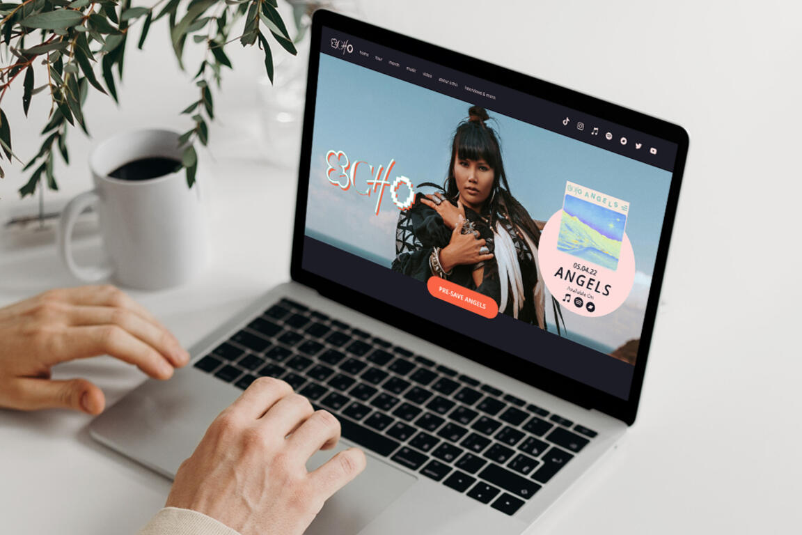
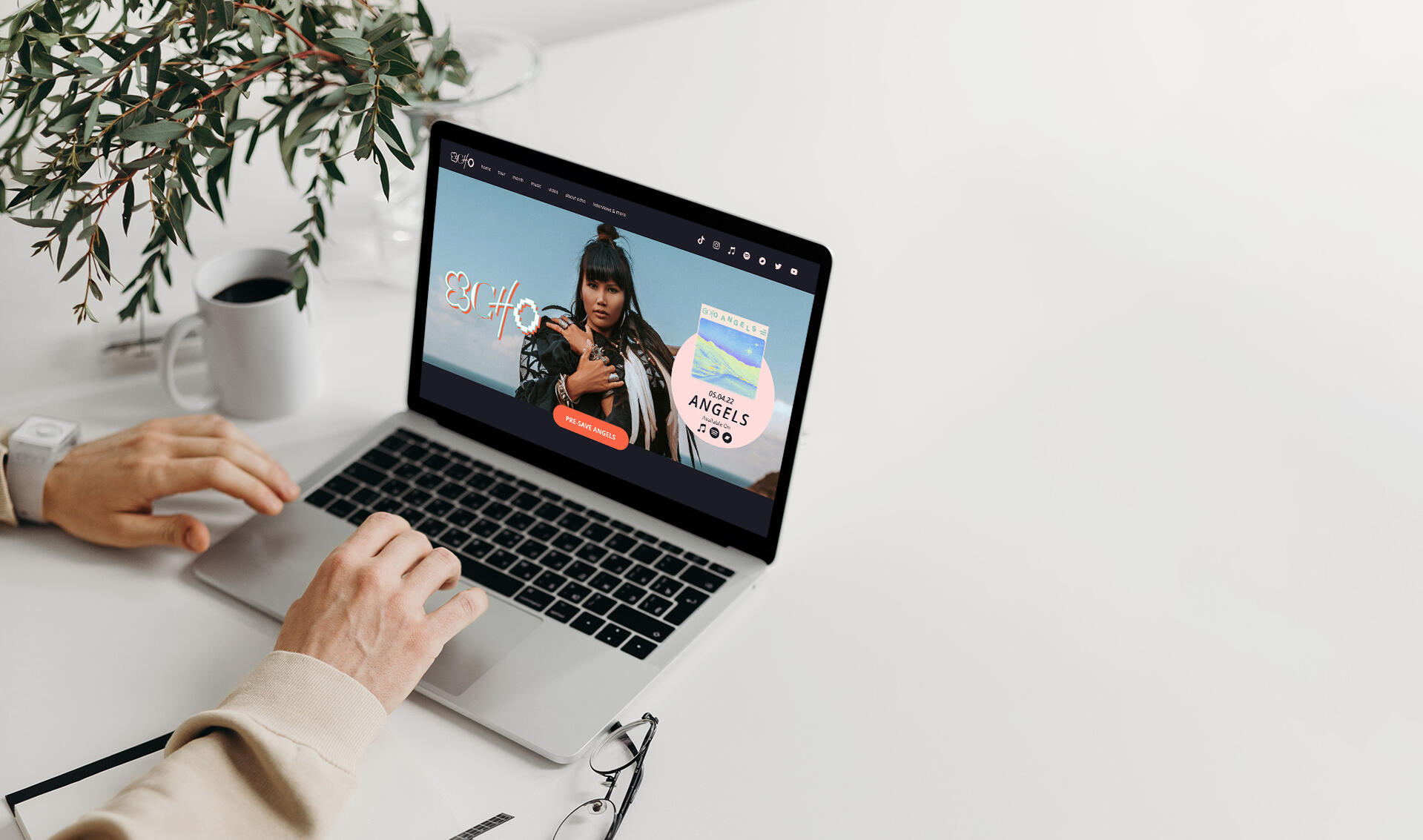
Echo is a Grammy-winning songwriter stepping into the spotlight as a solo artist. In a bootcamp design sprint with Elizé Presents and RCA Records, I designed an engaging desktop website to deepen her connection with fans and drive pre-saves for her debut single, "Angels."
Key Deliverables
Proof of Concept, Prototype
Context: Reimagined how independent musicians foster community in the streaming era without relying solely on algorithmic feeds.Key Actions:
Executed an accessibility audit to ensure full keyboard navigation, screen-reader parity, and high-contrast color standards.
Built a modular design system from wireframes to high-fidelity clickable prototypes.
Developed the responsive front-end interface directly to ensure high performance and tight visual fidelity.
Outcome: Launched an accessible, interactive digital home for the artist that deepened community engagement and gave fans a dedicated touchpoint.

High fidelity design of Echo's website

High fidelity design of Echo's fan-only website, Echo Lounge.


09
Local News Lab
Category
Journalism, Machine Learning
Role
Product Designer
Duration
2021 (6 months)
Overview
Local News Lab (LNL) , an open-source initiative by Columbia University's Brown Institute for Media Innovation, builds tools to sustain local newsrooms. I was brought in to refine LNL’s content recommendation engine for pilot partners The Philadelphia Inquirer and The Texas Tribune.
Key Deliverables
Design workshop, Product iteration
Challenge: Local newsrooms struggled with reader engagement and algorithmic echo chambers, risking audience mistrust and implicit bias in story distribution.
Approach: Facilitated cross-functional co-design workshops with journalists, editors, and engineers to define ethical recommendation criteria, iterating on machine learning models that balance reader interest with civic breadth.
Impact: Delivered an interactive ML recommendation framework that empowered newsrooms to surface relevant local coverage while actively reducing algorithmic bias and echo chambers.

Miro board of digital post-its were placed by cohorts, showing their ideal features and how much an impact it'd make on their sites.

10
Wine & Spirits Magazine Website
Category
Publication, eCommerce
Role
Lead UX/UI Designer, Front-End Developer
Duration
2017-2019
Overview
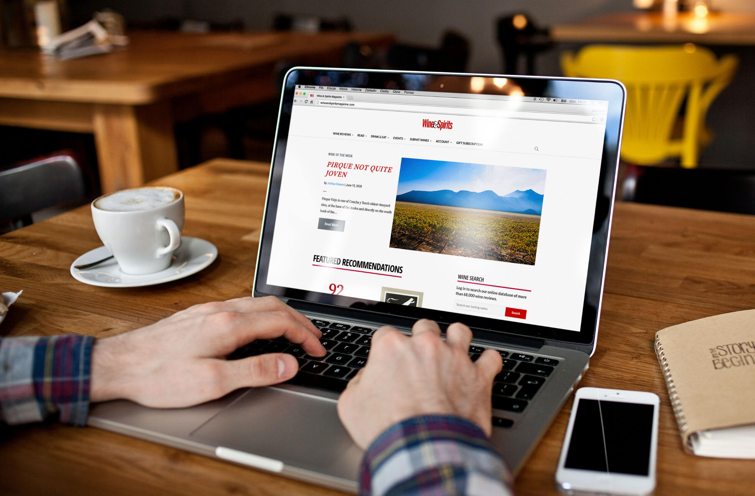
Wine & Spirits’ site originated as legacy .ASP files before migrating to ExpressionEngine (EE) in 2014. Despite EE's functional limitations, we were locked in by existing licensing. I led a ground-up redesign, prioritizing navigation, checkout flows, and paywalled longform content tailored to both industry professionals and wine enthusiasts.
Key Deliverables
UX/UI and development, Live website, Design iteration
Outcome
The website saw a 124% increase in site traffic 3 months post launch. Digital subscriptions increased 50% based on WooCommerce data.
Challenge: Outdated .ASP/ExpressionEngine architecture, high subscription drop-off, and an archive of tasting data that was difficult for both casual wine lovers and trade professionals to navigate.
Solution: Redesigned the publication from the ground up, restructured the information architecture for dual audiences, migrated the site to WordPress, introduced an editorial preview paywall model, and hand-coded responsive front-end templates. I also replaced cost-prohibitive third-party paywall plugins with custom internal workflows.
Impact: Despite the success of the website relaunch with 124% increase in site traffic and a 50% lift in paid subscriptions, the magazine has ended its print publication on May 2024 and closed its doors. Everything from hereon would be published via the website, tasting notes and all.

Before and after reveal of Wine & Spirits homepage

A simplified subscription tier system helped convert visitors into subscribers.

A feature content page hidden behind a paywall.

A before and after of W&S' Dining Reviews section


Other Design Work
Prior my change to UX, I was a designer of many trades: digital and graphic design, print design, branding, web design/development; you name it, I most likely have done it. Except for screen printing; I still want to try that.Below are some samples of my work.Please click on the images below to see them larger in modal.


About
I just wanna make good sh*t.
Core design values
Useful
Accessible
Impactful
What makes up my experience?
6 years and counting
UX/UI and product design
16 years
Graphic and digital design, responsive design
and web development
What kind of designer am I?
With a hybrid background in graphic design and front-end development, I balance high-level systems thinking with pixel-level execution. I ask the hard "whys" to navigate complex B2B/B2C products, design systems, subscription models, and accessibility.In a previous life, I was a production director for a wine magazine where we geeked out over terroir and the like, hosted wine tasting events in SF, LA and NYC, did email marketing (not very fun, honestly), freelanced for a minute with some cool clientele and a junior designer at Marvel Entertainment.
Life Outside Work and Design

My dog Kumo

Illustrating

Volleyball

Video games


Résumé
Email: [email protected]
Social Media: LinkedIn
Experience
| Company | Job Title | Duration | Location |
|---|---|---|---|
| WongDoody | Sr. UI Designer, PX | 2021-Present | New York, NY |
| Local News Lab | Product Designer | 2021-2022 | New York, NY |
| Career Break | Transition into UX/UI design | 2020-2021 | |
| Wine & Spirits magazine | Production Director | 2018-2020 | New York, NY |
| Production Manager | 2013-2017 | New York, NY | |
| Zeta Global | Graphic Manager | 2011-2013 | New York, NY |
| PP List Management | Graphic and Web Designer | 2008-2011 | New York, NY |
| Marvel Entertainment | Web Production Assistant | 2007-2008 | New York, NY |
| vivdesigns | Design Consultant/Freelancer | 2004-2022 | New York, NY |
Certifications & Education
| Degree/Certificate Name | Issuer | Year |
|---|---|---|
| Into Design Systems Conference | Advanced Design Systems | 2025 |
| Infosys Accessibility Centre of Excellence | Certificate in Digital Accessibility with Live Accessibility Audits | 2023 |
| General Assembly | Certificate in User Experience Design | 2019 |
| CUNY Baruch College | Certificate in Web Development with Open Standards | 2013 |
| CUNY Baruch College | B.A. Graphic Communications; Japanese minor | 2006 |
Skill Set and Expertise
Accessibility Audit (WCAG 2.1/2.2)
Component Libraries
Cross-platform UI
Design Systems
Mobile App Design
Prototyping
Visual Hierarchy
Micro-interactions
User Workshops
Usability testing
Research and Analysis
Competitive Analysis
Personas and Journey Maps
Information Architecture
Research Synthesis
Design Tools
Adobe Creative Cloud
AI tools (Microsoft Copilot, ChatGPT, Claude, Google Gemini)
AxeTools
Figma (Make, FigJam, Design Agent)
Framer
Google Lighthouse
Miro
Notion
ProtoPie
Sketch
WordPress
SquareSpace
Stark
VoiceOver
Webflow
Coding
HTML5/CSS3
PHP (Working knowledge)
JavaScript (Working knowledge)
React.js (Basic knowledge)
WAI-ARIA
Spoken Languages
English (Native)
Cantonese Chinese (Native)
Japanese (Conversational)
Korean (Beginner)